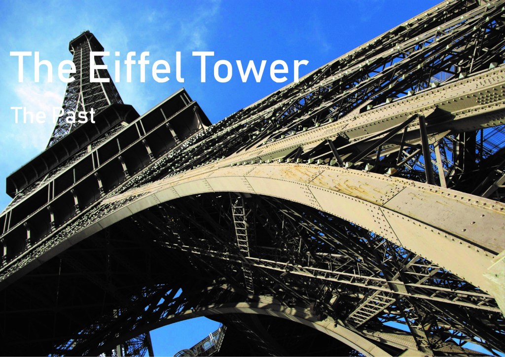
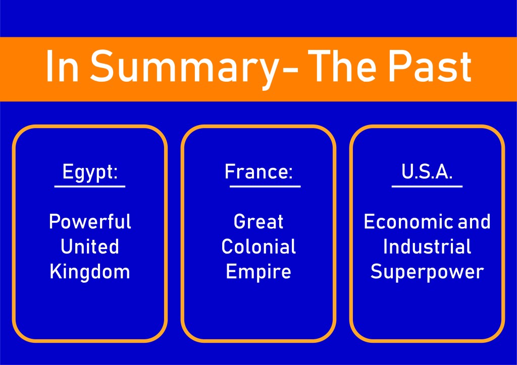
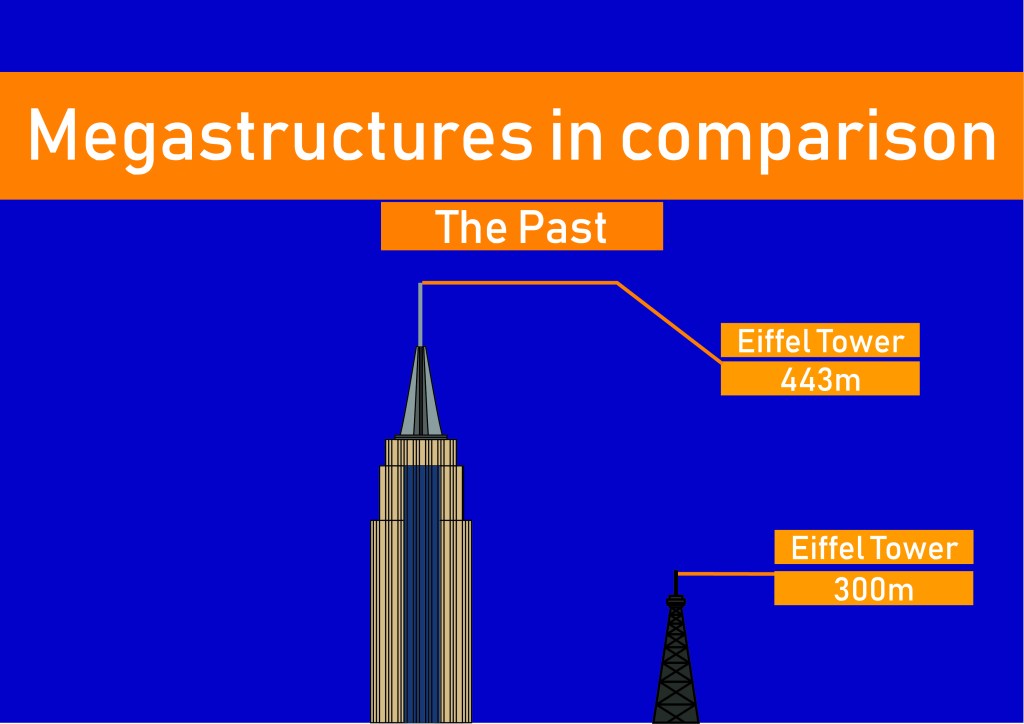
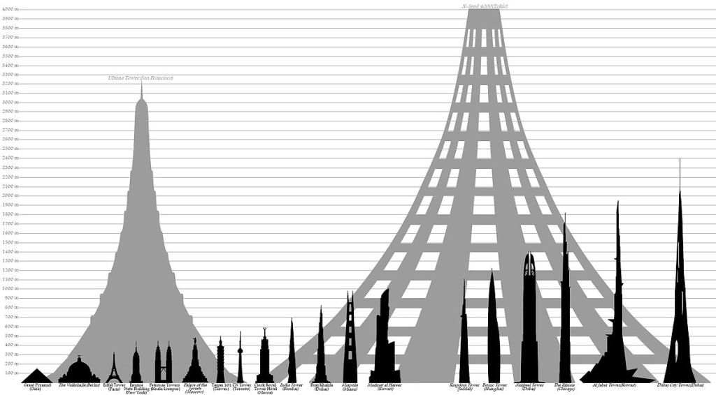
My Pecha Kucha presentation was on the design know today as the ‘Mega-structure’. I discussed why designs of such magnitude are created and the influences, both internal and external to the designer in creating them. I also discussed how these designs have changed throughout history, from the Pyramids to the Eiffel tower, Empire State building, Burj Khalifa, Trump Tower and X-Seed 4000.
I believe that my Pecha Kucha overall went well with a good display of research, analysis and critical thinking. I had practiced keeping on time and compensating for the fact that I would talk faster because of nerves. There was only one slide that I had a major pause for about 4 seconds due to me reading too fast.
In terms of visual presentation I believe the use of ‘info-graphics’ and my own illustrations helped differentiate myself from the heavily image based presentations of some students.
I possibly could have used more images but too many would have distracted the viewer from the oral presentation of information. I may have needed to trim down the large quantities of research however I believe as I was doing such a broad topic it was necessary to show in depth analysis.
Unfortunately there was little class feed back but the class seemed to like it. Those I sit next to said I spoke well and had a lot o information.
Topic: ‘Human centered design-Designing for disabilities’
The presenter was very fast and could have had less information to digest. However its was clear enough to understand the main ideas and that the student had done a high level of research. This research into history of the design field, statistics and empathetic talk conveyed how people with disabilities have interacted with design.
Specific examples include how the World Wars created a new need for design solutions. ‘A.D.A.’ Americans with disabilities act was signed in 1990 in the U.S.A., while there was a similar one in Australia -the national disability strategy. The student explained the idea of equal accessibility designs, such as prosthetics, hand rails, ramps, hearing aids and tones more well referenced researched.
The visual presentation was wordy with large amounts of information displayed. This paired with the large chunks of info already being verbally presented meant the audience may not have been able to effectively take it all in. I believe it would have better to have a completely image based visual presentation in my opinion.
Overall the peer showed great understanding and interest in her chosen field, displaying lots of information, understanding and research.
Overall the student did a well presented and informative presentation that explained the history of title sequences and how they are used today. It also felt more personal than other presentations, with the student explaining which ones she liked and why and how these have been influenced historically by design.
Although quiet the presenter was clear enough to understand, and it was well structured presenting past then present design in a fashion that led to better audience understanding of the design field. There was a large amount of imagery employed in her Pecha as well, which wasn’t too distracting.
Understanding of examples presented with an interesting and engaging topic allowed for an overall effective display of the history of the design of title sequences.
Throughout the reading, Cramer explains post modernism as an almost romanticist objection to the current movements in art and technology. He justifies this with the inclusion of the revival of previous, less technology based approaches to art, such as hand craft and the use of older devices. This objection to that of the near complete digitization of most aspects of the arts carries the idea of ‘nostalgia’ but also somewhat ‘ignorance’ in Cramer’s eyes.
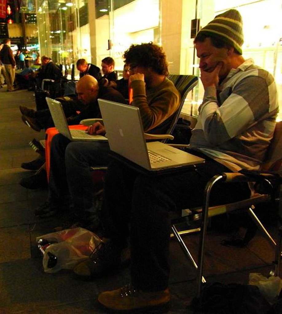
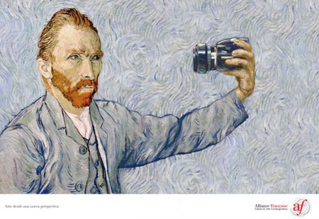
Cramer discusses the idea of how there seems to be the constant need to ‘upgrade’ our technology to the next innovation “from SD to HD and 4K, from DVD to BluRay, from 2D to 3D” – always marketed with a similar narrative of innovation, improvement, and higher fidelity of reproduction.” (Page 6). This idea attaches to the concept of product buyer/owner discussed in week 6 in Berger’s discussion of ‘Ways of Seeing’, with the constant influence of the product owner with the latest tech. This can be seen below in the ironic photograph, with people lined up using their apples products simply to buy more.
‘The Converstaion’ discusses this idea of consumerism and the idea of the “must have item” fueled by trends created by the major companies.
Cramer discusses many areas of the digital world including its definition, exploring different interpretations of what is digital such as the official one but also his own and other scholars such as Cascone. “‘Digital’ simply means that something is divided into discrete, countable units – countable using whatever system one chooses” (Pg 8).
I read some of Cascone’s paper which also highlights the idea of the nostalgia of music and how the once new technological mediums such as “glitch, microwave, sincore” are now past, leading to a new post digital aesthetic. (Sited below)
Post Digital seems to be too hard or too varied in interpretation in order to be adequately defined. Cramer takes into consideration many definitions and ideas, from the nostalgia of the past, just the rejects of the present or the combination of the chaos, disenchantment and sentiments that have risen due to this new age of technological innovation.
This is important knowledge that can help my in future with design with technology and these ideas discussed ever present in our world and this design field. The opinions of designers and scholars will help me understand the varying ideas of post digital and its impact on my life.
More Research(Week 8)
This talk about post digital brings highlighted the idea of how post modernism has impacted and influenced the modern artist. The directness of artists with their audience as well as how the audience has access to the artist is an interesting aspect, with artists no longer being a plaque on the wall but a contactable person. This idea of how the artist is now almost a public figure, exposed and no longer able to hide in their studio with the new communication technologies of today. “Today we are facing the constant demand for content” (2:15) Deylen states in his talk, and goes on to explain how this push for new content and the lack of rules with these new sources of income ‘iTunes’, ‘Spotify’, ‘YouTube’ etc are what has also driven this new consumerism. His brings us into the design in music field with the artist as the musician. It is interesting and important to understand the fields and impacts of design and their relationship with that of technology of old and new. The idea of post digital and digital media’s influence on my future designs is extremely important to know.
This week I have been too focused on the Pecha to do much research into the ideas of the HCI, I did find a more ‘interesting’ explanation of the subject however: https://www.sciencedirect.com/topics/computer-science/human-computer-interaction that explains the design field quite well. I also briefly looked into the interactions of the HCI field and the UX (User Experience field, and how new technologies such as VR are being influenced by our understanding human interface interaction.
I have researched more into the Megastructure topic of my Pecha Kucha and found an interesting design known as X-Seed 4000. The largest fully designed building in history that would stand at 4000 meters tall and house between half a million o a million people in a vertical city.
Unfortunately the only picture I could find that compared it to modern buildings was on Wikipedia commons (Hard to find images of something that doesn’t exist yet). The building was designed by the Taisei Construction Corporation as a sustainable city and could one day be built it the funds were ever raised. Other designs I also came across is a floating city that is a kilometer long and would house 50,000 people, called the Freedom Ship. The building company is looking for investments according to some sources as it cannot be built on a dry-dock, due to its immense size.
Unfortunately the group task of using HP reveal for a treasure hunt didn’t go to plan with the app bugging out, people not doing it, and lack of understanding of the app.
It did however, highlight the issues with uniformity still faced by designers today with apps becoming an ever increasingly large part of our lives and degrees. I believe the requirements to make an understandable and efficient user interface, which is necessary for any user, was not complete. It also seems more designer/user talks that could have better helped design the app itself.
Bugs in the app were a problem for me and will always be an issue for those designing in software, with new technologies, updates and products on many different platforms release daily. I did some research on apps and found in 2018, 194 Billion apps were downloaded, and there are currently 2.6 Million android and 2.2 million I.O.S. apps. (Iqbal M, 2019) https://www.businessofapps.com/data/app-statistics/
The HP app was overall buggy and also the image quality was in some of the animation awful. It could have been a problem with my phone due to it being an IOS-Andriod hybrid.
Manovich discussed throughout the reading the idea of HCI- human computer interface; the idea of how Humans are affected and how the affect computers and media.
Computers became a source not only of as a typewriter but a source of new media and a way distributing information and ideas to a larger audience.
Manovich argues that the design of computer interface and organisation derived from pre-existing designs already pre-established design ideas. This can be seen today with document organisation on computers, with files still designated by their name or number and in an order similar to that of a library. Also the save icon on most documents is still in the symbol of the floppy disk. This helps in my understanding of design by explaining the different interactions and formats of design on computer and technological interfaces. If I was to ever design documentation or interfaces, the understanding of this design idea is important.
This can be seen with the organisation of the documents on your computer. This also attached to the idea of Isotypes and universal language. With people of all languages needing to understand this for of organisation and documentation.
The reading itself is an example of digitization or liberation, with its re-purposing of pages and form to suit that of the reader.
Manovich also talks of a ‘liberation’ of media with such designs as books now digitized and accessible to mass audiences. They are also modifiable and able to be transformed into annotated form. This is idea is seen with the reading itself. With a mass amount of students able to access, annotate and interpret a single piece of media. The physicality of the design however is somewhat lost as well as the permanency of its design, as it is able to be in a way destroyed to suit the audience.
An interesting area of design I came across when looking into the sphere of advertising which is the focus, in part, of this weeks reading, was the fake commercials made by the Soviets.
I don’t have a lot of time this week due to multiple assignments being due including the Pecha Kucha. It turns out that the Soviet Government required 1% of company earnings to be spent on advertising, meaning sometimes companies would simply make up products for the sake of advertising. This is in stark contrast to that of Berger’s capitalist advertising subject, with the government and companies create adds for products that no one will buy, to create the idea of an abundance of products in a country were it was scarce. Products such as mince chicken and new cars that would never be produced, aimed at the working class which was the vast populous of the USSR. Berger explained in his reading that this class of society needs advertisements on what a product does, rather than the pleasure of having it.
Another interesting aspect of design in relation to this is the growth of Soviet nostalgia in Russia documented and studied by Halvena W, Matveev A and Holak S. They suggest a rebirth in some way of the old Soviet design art and design style. This is useful to me as I am interested in the Soviet style of design, keeping an eye on this rebirth may help influence and inspire my designs in this degree and further on down the track.
Publicity – Berger explains the idea of how the visual identity of publicity is used to influence the audience and buyer/owner.
The purpose of publicity is to use the spectator owner’s image to make the spectator buyer dissatisfied with their way of life. The owner offers an improvement through envy. The idea that the buyer is in envy and is influenced by the publicity of the the owner. This is seen today in various adds especially using celebrities that create the idea of perfection and pleasure. Publicity cannot however be about the product itself however if it is to be effective, as Berger explains the idea of the pleasure of the product is what creates effective publicity, the idea the buyer will experience pleasure once they become the owner. A current example of this is seen with many product such as iPhones and cars, that offer through their publicity and design create the idea of excitement and pleasure once owned.
Berger does however suggest how different strategies are required for the working class. Publicity’s goal in advertising to the working class is a transformation through the purpose of the product, rather than the atmosphere created by it like the middle class. This can be seen in examples such as tool adds for ‘tradies’ that suggest the lack of ‘manliness’ of the spectator buyer compared to the spectator owner, such as ‘Tradie Tools’.
Today there are many areas of publicity that utilize famous paintings to “suggest a cultural authority, a form of dignity, even of wisdom…” The advertisement by ‘Alliance Francaise’ utilizes Van Gogh’s self portrait to grab the audience’s attention and as Berger suggests, creates he idea of cultural authority but also parody. Berger states that through this idea the viewer perceives this publicity as cultural, with a sense of wisdom and superiority compared to the normal ‘vulgar’ content of other ads.
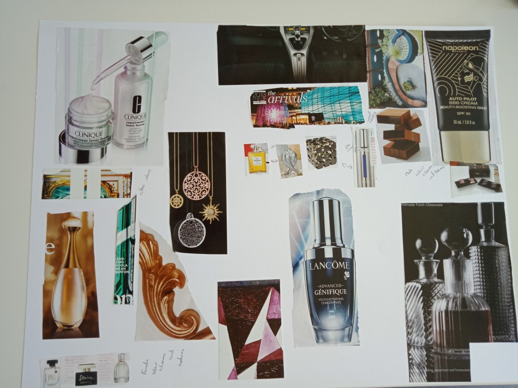
For Lab X we chose a sleek and metal based mood board (seen on the right of the board) for the male products. Taking influence from expensive glass wear and silver. There are multiple ideas for the physical bottle including a cube or cylinder. The female products on the other hand we decided on gold as the main colour. The mood board on the left exphasises this idea as well as more ideas for the female products including the colour emerald and flourishes and a flower or fish composition.